Validate Element Attribute (Mobile)
Validate any element attribute in your mobile app
The element attribute validation allows you to validate the value of attributes within your app screen elements.
Adding a Validate Element Attribute step
To add a Validate Element Attribute step:
- Hover over the (arrow symbol) where you want to add the validation.
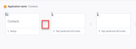
The action options are displayed.
- Click on the Toggle breakpoint button.
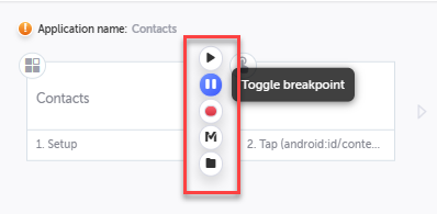
- Click on the Run test button, to run the test until the breakpoint.

- Hover over the (arrow symbol) again and click on the “M” (Testim predefined steps).
The Predefined steps menu opens.
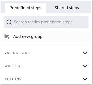
- Click on Validations. The Validations menu expands. Scroll down through the menu and select Validate element attribute.
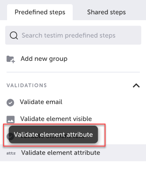
Alternatively, you can use the search box at the top of the menu to search for Validate element attribute.
- In the AUT window, identify the relevant element for which you wish to validate an element attribute, and click on it to select it. You will need to know the element's attribute name to configure the validation.
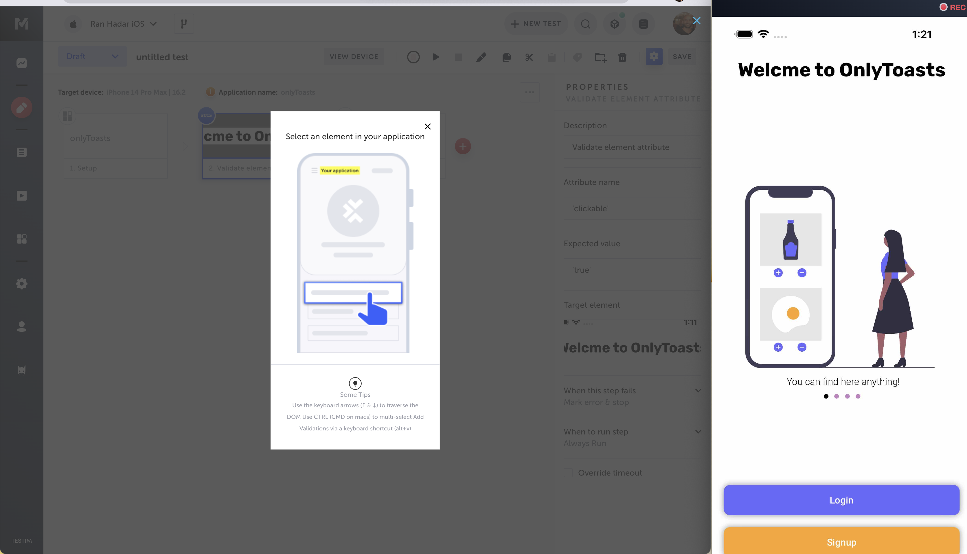
- The Element Attribute Validation form is shown.
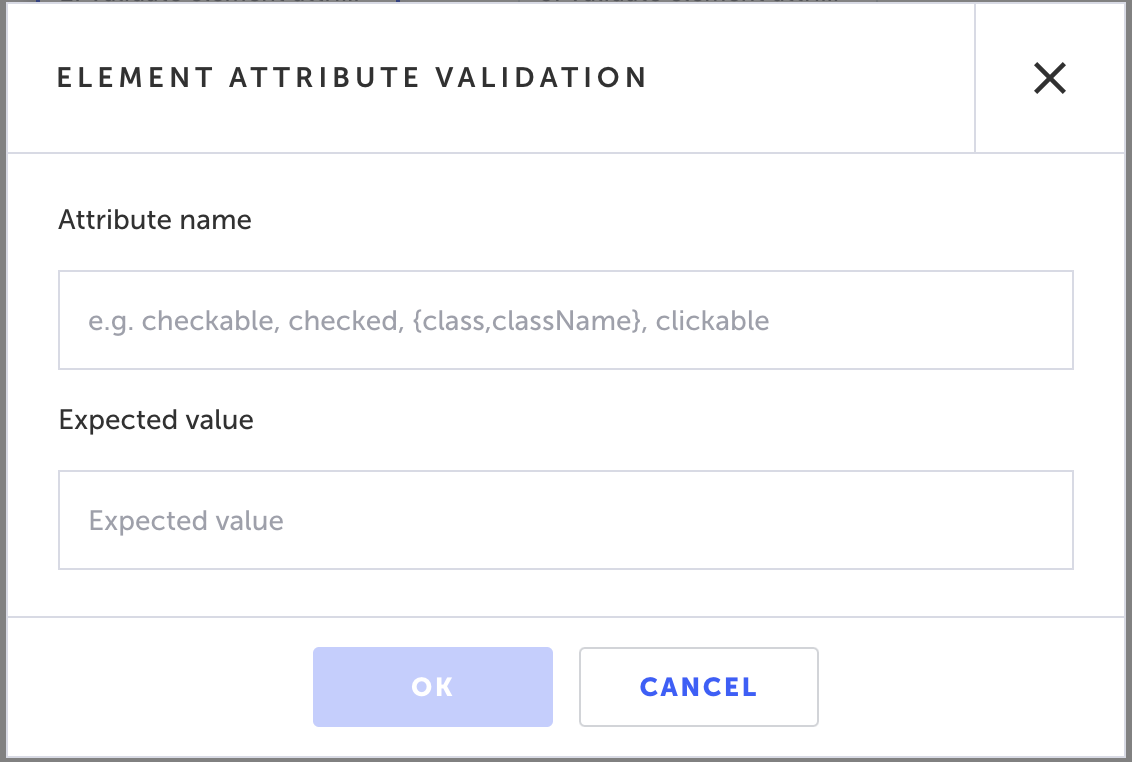
- In the Attribute name field, enter a valid element attribute name that you wish to validate (e.g. checkable, checked, className, clickable). For a list of possible attributes, see, List of possible attributes.
- In the Expected value field, enter the value you wish to validate for the attribute (e.g.
true).
When modifying the value of the Attribute name and Expected value in the Properties panel, make sure they are enclosed in single quotes: e.g. ‘enabled’ and ‘true`.
For the expected value you can use regex.
Testim will validate whether the selected element attribute's expected value is present when running your test.
- Click OK. The “Validate element attribute” step is added in the Editor, and a thumbnail of the selected element is shown in the step.
- Click on the Toggle Breakpoint button after the validation step to remove the breakpoint.
Modifying a Validate element attribute step
If you want to change the element you selected, you don’t need to delete and re-record the step. Instead, you can reassign the element with a different element. Alternatively, you can modify the attribute name and/or expected value of the original element you selected without selecting a new element.
To reassign the selected element in a Validation step:
- Hover over the position to the left of the step for which you want to reassign the element and click on the Toggle breakpoint button.
- Click on the Run test button to run the test until the breakpoint.
- Hover over the step for which you want to reassign the element and click on the Show Properties (:fa-cog:) icon.
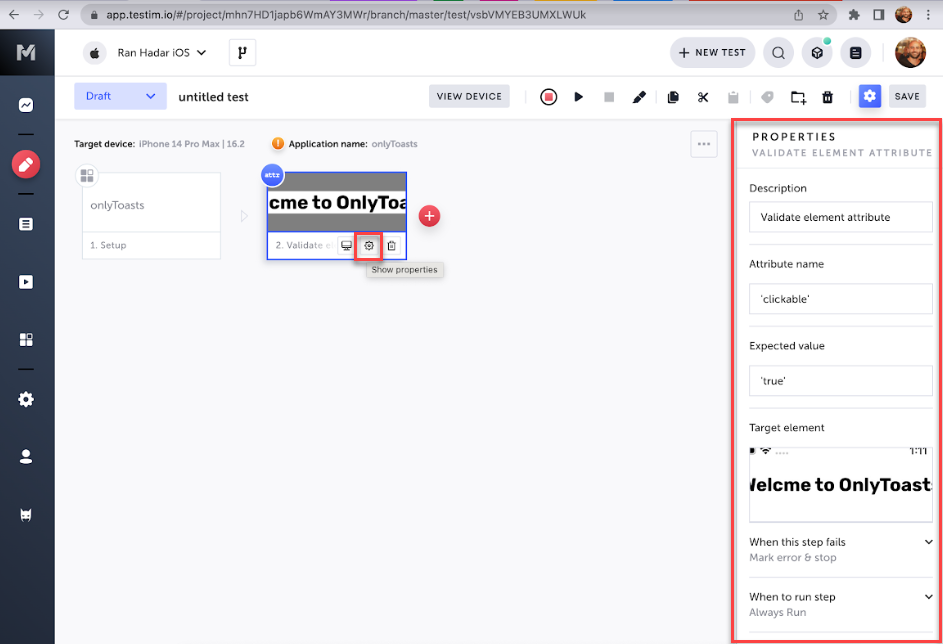
The Properties panel opens on the right-hand side.
- Hover over the Target element thumbnail to show options, and click Reassign.
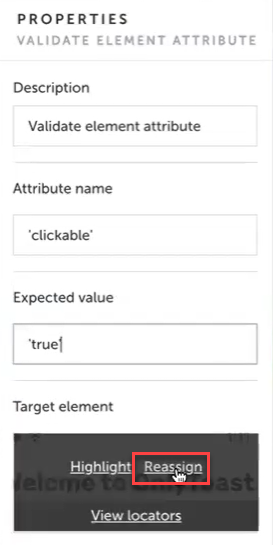
- In the AUT window, identify the new element that you would like to select and click on it.
The selected element is shown in the Target element box in the Properties panel. - In the Properties panel Attribute name field enter the attribute name for the new element.
- In the Properties panel Expected value field enter the expected value of the new attribute.
When modifying the value of the Attribute name and Expected value in the Properties panel, make sure they are enclosed in single quotes: e.g. 'enabled' and 'true'.
- Click on the same Toggle Breakpoint button to the left of the step for which you reassigned the element to remove the breakpoint.
To modify the properties of theoriginal element:
- Hover over the step for which you want to reassign the element and click on the Show Properties (:fa-cog:) icon.
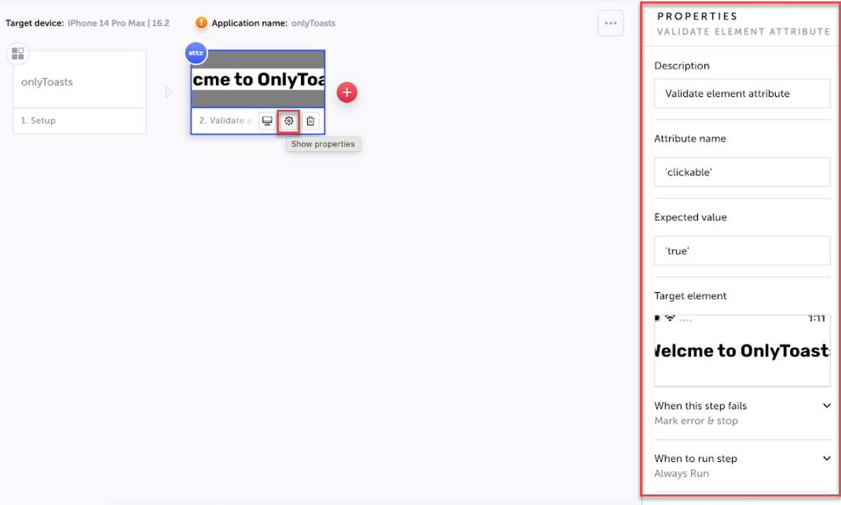
The Properties panel opens on the right-hand side.
- In the Properties panel Attribute name field enter the new attribute name for the element.
- In the Properties panel Expected value field enter the new expected value of the attribute.
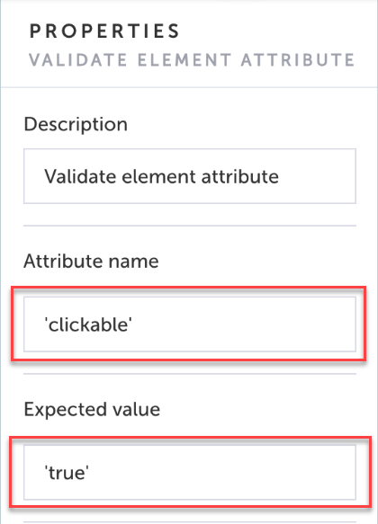
When modifying the value of the Attribute name and Expected value in the Properties panel, make sure they are enclosed in single quotes: e.g. ‘clickable’ and 'true'.
List of possible attributes
iOS attributes (using Appium)
- checkable
- checked
- {class,className}
- clickable {content-desc,contentDescription}
- enabled
- focusable
- focused
- {long-clickable,longClickable}
- package
- password
- {resource-id,resourceId}
- scrollable
- selection-start
- selection-end
- selected
- {text,name}
- hint
- extras
- bounds
- displayed
- contentSize
Android attributes
- UID
- accessibilityContainer
- accessible
- enabled
- frame
- index
- label
- name
- rect
- selected
- type
- value
- visible
- wdAccessibilityContainer
- wdAccessible
- wdEnabled
- wdFrame
- wdIndex
- wdLabel
- wdName
- wdRect
- wdSelected
- wdType
- wdUID
- wdValue
- wdVisible
Updated 6 months ago
